By Silvia Montoya, Director of the UNESCO Institute for Statistics

Our recent blogs have focused on the difficulties of trying to gather robust and internationally-comparable data on education, with policymakers, researchers and citizens struggling to make sense of conflicting numbers from multiple data sources, or trying to find any numbers at all. For non-statisticians, the data picture is blurry, at best. Various blogs have argued that the lack of data is a real stumbling block to the pursuit of Sustainable Development Goal (SDG) 4 on education and the Education 2030 Framework for Action. The good news is that things are about to get a lot easier.
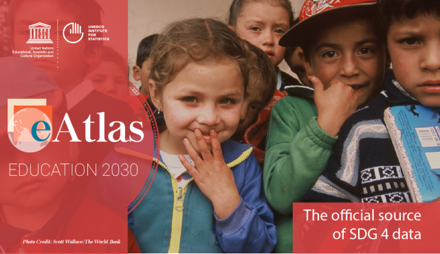
Today, the UNESCO Institute for Statistics is launching the very first eAtlas for Education 2030, as part of our mandate to produce the data needed to monitor SDG 4 by working with a range of partners. With this ground-breaking initiative, we have pooled everything that is currently known about access to education, the quality of the education on offer and the results for children and young people. This one-stop shop is a continuously-updated series of interactive maps organized by every SDG 4 target for every country with available data. The eAtlas already includes a massive amount of data used to calculate the official global and thematic indicators, as well as ‘placeholders’ for indicators not yet available. It includes all the basics, such as completion rates from primary to tertiary education, the percentage of children out of school, the amount being spent on each pupil’s education, and the supply of qualified teachers. But it goes further to include gender disparities, the relevance of education, the safety of the school environment, and the number of adults who are enrolled in primary education programmes.
Despite the huge amount of data on offer, the eAtlas is simple to use. With just a couple of clicks, anyone – an expert statistician or an ordinary member of the public – can explore, for example, data on digital literacy in Turkey or the school bullying situation in Namibia. Each map view can be customised, and they can all be shared via social media, downloaded and embedded for use wherever they are needed – from websites and blogs to presentations and reports. With this highly-visual approach, countries can easily explore the data and use the different indicators to develop their own monitoring frameworks.
We have great ambitions for the eAtlas: it is designed to be the go-to source for education data, a place where anyone can get the data they need quickly, with the confidence that they are getting the best available statistics. The maps are updated automatically, which means what you see is always the latest published information.
There are, inevitably, some gaps. For example, five of the SDG 4 targets involve the measurement of learning, for which there is, as yet, no agreed framework for the production of internationally-comparable indicators. Some of the maps show vast swathes of the world that remain blank, awaiting good data on a particular issue. But the eAtlas is a ‘work in progress’, with new data being added the moment they are available and a continuous and growing stream of information allowing more and more comparison.
This is a major responsibility for the UIS, but fortunately, we do not have to shoulder that responsibility alone. While we have been given the mandate to produce the data needed to monitor progress and channel policies and resources to those in greatest need, no single organization can hope to produce data on all of the indicators required. That is why we have been putting so much of our energies into building the partnerships and alliances that are so critical, not only to fleshing out the eAtlas but also for the achievement of SDG 4.
Leave a comment